I loved receiving this email in my inbox and had to share it with you. Melinda Morris of Lion in the Sun, says, "The most important design element of the invitation is the font. While graphic elements set a tone, your words and how they are presented make the biggest statement of all."
So, what does your invitation font say about you? Whether your wedding vision is contemporary, traditional or vintage, there's a font that can say it for you. I love this because so often it's always the design that is talked about, and very rarely the font choice.
Melinda, who helps brides and grooms navigate the vast array of font choices each day, is here to offer a few suggestions:
 Above Left: Mixed | Above Right: Big & Bold
 Above Left: Handwritten
Mixed (Most Popular) – Combine a print and script font for a vintage or playful feel. Serif is more formal, while san serif tends to be more contemporary. Be sure to choose two fonts that are very different from each other and no more than three.
Big & Bold – Using fonts as your graphical element will give you a contemporary feel and make a big statement. It’s a clean look and frees you from committing to a graphical theme.
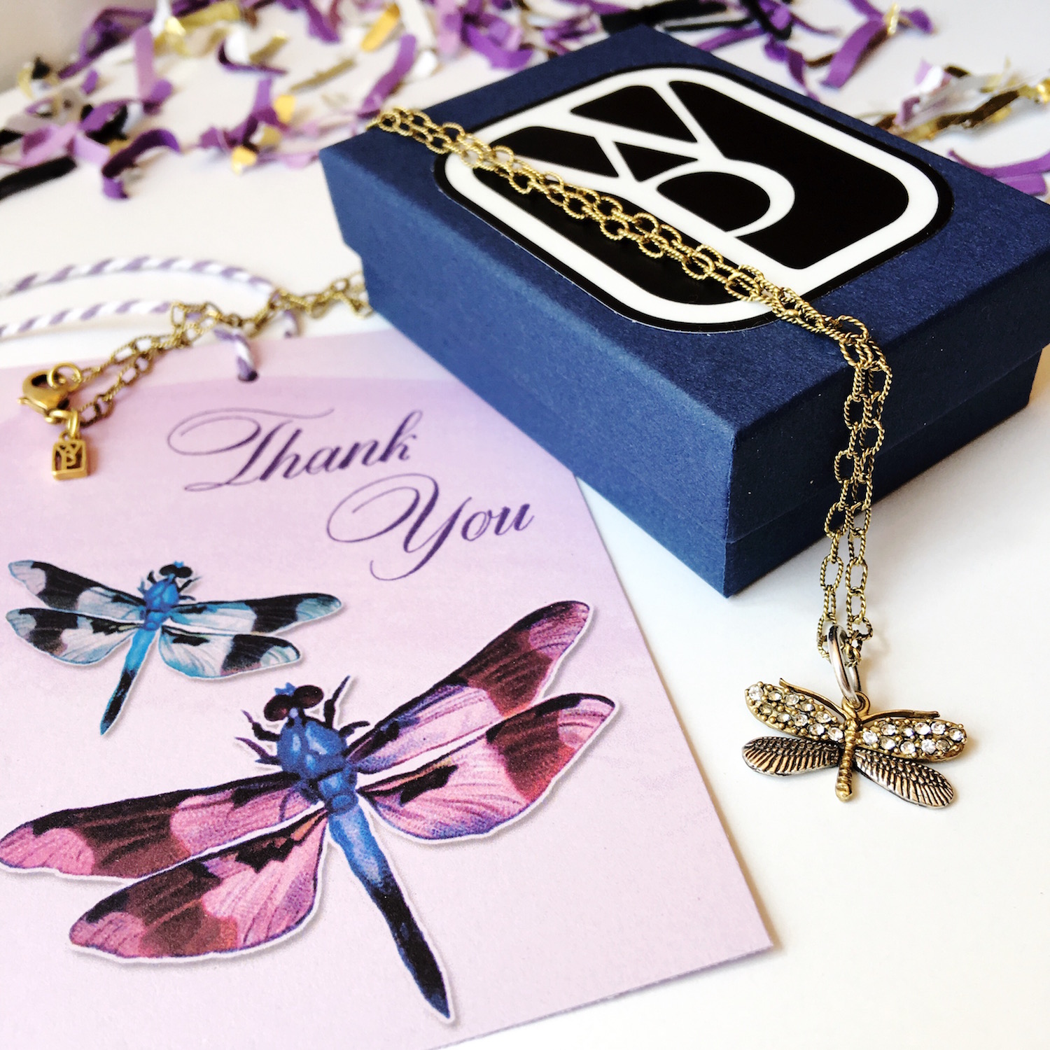
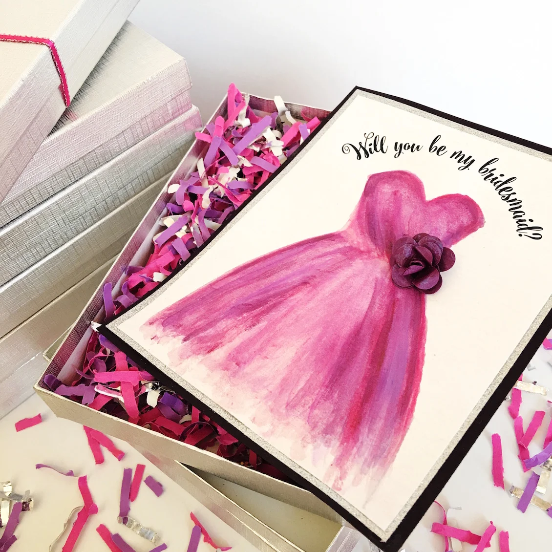
Handwritten – Actual hand written text can be converted to artwork on your invitation and presents a formal, elegant or colonial feel. You could also use a font that looks like handwriting or written with a quill pen complete with splatter.
And, Melinda says for an extra splurge – Hand calligraphy truly creates a one of a kind unique handmade invitation.

